
Role
UX/UI Designer
Team
3 Front end | 4 Back end Developers
3 Months
NDA: Visual designs have been altered and rebranded to protect the employer’s intellectual property.
CONTEXT
Creating a 0→1 Financial Dashboard for B2B Users
After reviewing stakeholder requests, examining the current project status, and determining business priorities, I discovered the issues of the project and began designing a full-scale dashboard.

PROBLEMS
Discovering the challenges.
Considering the stakeholders’ business priorities, I worked on specifying the problems that needed to be addressed within the dashboard.
No information architecture - Lack of a structured dashboard navigation or information to organize information and analytic requirements
No user flow - No clarity over how users would navigate within the dashboard
Lack of key performance metrics - Lack of KPIs to help users track analytics that impact their business operations
Determining requirements - No prior information or research on what users need
CHALLENGE
Create an intuitive financial dashboard UI that showcases essential KPIs and is usable for users of various skill levels.
TIMELINE
Due to changing stakeholder requests over the course of the project, we encountered a few delays during design and development.

Design Principles.
Evaluating how the issues affect the user experience and overall design interaction:
Visual Hierarchy
As I’ll be dealing with a vast amount of data and information, I focused on using an inverted pyramid structure for KPIs followed by supported trends, and the additional details below.
Cognitive Load Management
To reduce visual clutter and dashboard fatigue, I’ll be limiting the amount of data visualizations within each page.
Real-time Contextual Data Visualization
Based on the dashboard page, I’ll be using certain types of data charts that are relevant to each page’s purpose.
Strategic Use of Color
I’m limiting the color palette within the dashboard using a combination of neutral tones, shades of blue, and high-contrast colors to highlight specific information and increase readability.
Interactive Elements
By providing filters, hover-over tools, and clear labeling, it will reduce ambiguity and explicit data points. I also explored date pickers using a calendar selector, but due to time constraints, it was decided it would be added later with a simplified date selector temporarily replacing.
UX RESEARCH
Understanding the Problems.
After reviewing stakeholder requests and determining the business goals, I began my research by analyzing the current market landscape.

Key Insights.
After reviewing financial software in the current market, I noticed similar data chart trends when it came to design choices. Based on these findings, I utilized KPI widgets within the dashboard and various data visualization charts to provide contextual data. While I noticed there may be slight learning curves for inexperienced users if they may not understand KPIs, I decided to include data visuals so it’s easier for users to visually digest their analytics instead of listing them in a data chart which may be more confusing without the visuals.
It’s also important for users to have interactive elements within the dashboard so they can explore the data without the initial view becoming cluttered. There were common trends when it came to color psychology in the designs as well. These included color palettes being in neutral, muted tones for backgrounds, 2-5 colors for data visuals, and using high-contrast colors to highlight important data points or anomalies.
Widgets with KPIs are highlighted at the top of the dashboard for quick searches and visually simple to digest information.
Including interactive elements such as high-contrast colors, switching between data filters, and hover-over effects can help users focus on important data points and anomalies while navigating around the dashboard’s interface.
Gathering Insight through User Surveys.
As I was with a startup, there were both limited resources to gather a larger user group and time constraints I needed to consider. So, I utilized a user survey to quickly gather information within the deadline.

SAMPLE SIZE - 5 PEOPLE

Survey Results.
While a larger user group and user interviews would have been ideal to gather and understand deeper insights, the startup I was with did not have the resources or the time when I began working on the project. Based on the survey results, I noticed users highly prefer quick visual assessments for financial performance - specifically for revenue, expenses, payouts, and their invoice history. Users also want to have a workable dashboard for reasonable pricing since there are many high cost subscription plans for existing software.
Or if there are separate tiers, they want to have the minimum amount of analytics where they can still understand how their business is performing and which areas need improvement. There also was a preference for interactive elements so users could adjust the data visuals. The most popular elements were data pickers, time filters, hover-over tools, and clear labeling. These tools help users reduce ambiguity within their financial insights.
Balancing out key metrics and data readability is key to how users feel a dashboard measures their business performance.
White Paper Research.
In order to discover whether the design ideas I was considering were usable and support my design ideas, I conducted additional white paper research using the Nielson Norman Group reference site for data visualizations.

Identifying Essential Dashboard Trends.
I used these articles I found to further understand how to utilize different data charts to effectively present financial metrics. From my research, I settled on using various bar charts, line charts, pie graphs, and data tables to organize the different widgets. I also referenced the Gestalt psychology principle and utilized semantic grouping to organize the different information. I also grouped together overview containers to showcase the most common KPI metrics per section.
Settling Core Features. (Card Sorting)
Using the card sorting technique as a visual guide, I began breaking down the core features, potential ideas, and out of scope areas.

One of the biggest challenges when it came to designing the dashboard was determining which features to prioritize due to the time restraints. There needed to be a balance of the core features, what would be nice to add, but also stay realistic of what may not be options during the initial launch. Rather than prioritizing specific features, I focused on assessing the underlying needs reflected throughout my research.
Using the card sorting technique as reference, it helped bridge user feedback and my financial dashboard research so it would be based on these findings rather than assumptions. As I continued to notice recurring patterns, my goal became to understand why the patterns kept repeating and what it revealed about what users expect within a financial dashboard.
MVP Opportunities.
After compiling my research altogether, I identified four main features for the MVP. Based on what I found from my user research and themes I saw in my market analysis, I came up with dashboard features that were catered towards what B2B users may need. These included:
KPI Widgets
Breaks down and organizes key financial metrics
Visual Clarity
Intuitive layout to understand metrics at a glance
Financial Reporting
Business reports with deep insights about performance
Accessibility
Different language/currency options for global users
Structuring the Dashboard.
After gathering all my information, I began organizing everything together based on what was needed. Since the different pages within the dashboard had different information, I organized everything into a site map to outline how each section will be navigated. I also made it as a reference for the developers to help them on their end since they had a vague idea of how users would navigate around the dashboard before I started the project and they wanted a head start to begin coding it out as I finished different sections.

IDEATION
Conceptualizing the Dashboard.
After reviewing stakeholder requests, examining the current project status, and determining business priorities, I began sketching out my ideas:

I BEGAN WITH 9 ITERATIONS CONSIDERING THE CORE FEATURES IN MIND.
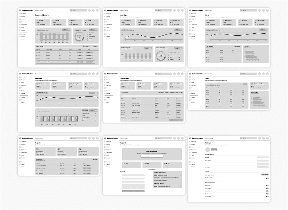
Once I outlined the MVP features, I began conceptualizing with lo-fi wireframes. I explored various layouts and data charts to include in the dashboard until landing on the best versions of my lo-fi iterations. When designing the initial wireframes, I primarily focused on including important data points that were the focus for the specific dashboard pages.
KEY DESIGN DECISIONS
Finalizing the Core Features.
After putting together the required functions, I began settling on dashboard features while making the hi-fi wireframes.
To ensure it was easy for users to keep track of the vast amount of information, I utilized filters, hover-over tools, and clear labeling to help reduce ambiguity and highlight important data points.
By combining visual design choices through psychology, visual hierarchy, widgets, and contextual data visualization, I created the final dashboard design.
Dashboard Widgets.
When considering the data visual widgets, I limited them to around 5-9 visualizations per page to prevent visual clutter and dashboard fatigue for users when scanning the page.
Each page within the dashboard only displays relevant data to support the core purpose through contextual data.
Accessibility Options.

Since the stakeholders anticipated global users, I included a currency and language switch button so users were more comfortable viewing the data in a familiar language
I also made sure the colors were within the WCAG standards in color contrast for better readability
Clear labeling with short, clear descriptive labels were added to help reduce ambiguity
Visual Hierarchy.

By utilizing the inverted pyramid organization concept, I placed the important KPIs at the very top of pages, followed by supporting metrics, and granular details near the bottom of the dashboard.
Since users need to easily navigate within the dashboard, I used a side column navigation menu bar to switch between the different pages depending on which metrics need to be viewed.
Design System.

To ensure visual consistency and at the request of the developers, I only used one font family with a system for specific font weights and sizes to make it more readable.
The spacial organization was designed by referencing the Gestalt principles through grids, whitespace, and clean margins. I used a 4 pt. system to ensure uniform grouping and spacing throughout the page and it’s elements.
Since there were various dropdowns, input fields, and elements, I utilized a variable system with various components to speed up the design process and create consistency within every page. This was also for future scalability as stakeholders mentioned they were considering additional premium subscription tiers which would include more in-depth analytics.
PROTOTYPE
Usability Testing Results.
While there were some issues the developers encountered, the initial prototype conveyed and functioned how the stakeholders desired.
While I included a language switch button, there was an issue the developers encountered during implementation and testing where the language would change, but the corresponding language’s currency would not change in the data charts.
It was unclear how quickly the issue could be resolved at the time, so the language feature may not be implemented during launch, but potentially for post-launch if it can be fixed.
Takeaways.
While I was pressed for time, there were still many things I wanted to include as I was designing the full scale dashboard. Due to the tight launch deadline, there were many features that I wanted to include for a better user experience, but was unable to. These included adjusting the currency/language button so it’s more clear that the language is also changed instead of only labeling the currency.
I would have also liked to have designed an improved time filter button to include a calendar selector so users can be more specific with the time frames. As users may have issues if they can’t view only a single day or a specific time, I thought it would make for a better user experience, however the developers explained the default filters were already implemented and it may take time to include the calender filter, so I decided to shelf it for post-launch to meet our deadline. Although I managed to complete the full-scale dashboard, I felt if I had more time to conduct research and not have a tight deadline, I could have created more detailed financial reporting and improved filtering tools.
Timeline Restrictions vs. Determining Key Features
Since I had to work with a tight deadline and consider how quickly the developers could create the dashboard, I had to focus on only including minimal features and the necessary KPIs while still meeting the functionality needs for B2B users and stakeholders.
Improving Filter Options
Although I wasn’t able to include a calendar filter, I would have liked to create a more advanced filtering system for each of the data visualizations since I feel it would greatly improve the user experience. As I was working on multiple features and not just the dashboard, I decided to shelf the functions until we could meet the necessary timeline rather than suggest an incomplete feature.
Conducting More In-depth Research
While I managed to create the full-scale dashboard, I feel if I had more time to gather additional data and conduct more user research, I would have a better arrangement of data visualizations, determining necessary tools, and structuring the dashboard.
What if(s)?
Once the financial dashboard is launched, there are a few key metrics that would can measure how successful the dashboard is.
These include usability testing metrics for key tasks including: reviewing recent transactions, a high task completion rate, minimal navigation errors, and reduced time for task completion. Specifically, these metrics would indicate whether the information architecture and interface is intuitive for users that need to quickly find information.
For long term metrics, I would also consider behavior metrics such as dashboard engagement, return visits, and feature interactions with the financial tools. Together, these metrics would provide insight into how effective the dashboard is through it’s efficiency, usability, user confidence, and long-term engagement.
Combining all these metrics would determine if the dashboard helps users confidently understand and manage their financial data.
ADDITIONAL SCREENS


THANK YOU FOR READING MY CASE STUDY!