
Building a secure onboarding flow
Role
UX/UI Designer
Team
3 Front end | 4 Back end Developers
2 Months
NDA: Visual designs have been altered and rebranded to protect the employer’s intellectual property.

CONTEXT
Building a secure registration flow requesting sensitive data
As the UX Designer for the project, I worked on the registration and application portal feature for a B2B user flow.

PROBLEMS
Discovering the challenges.
Considering the stakeholders’ business priorities, I worked on specifying the problems that needed resolving to optimize user sign up.
No information architecture - Since there were no guidelines or requirements from stakeholders, there was no information about what was required, how it would flow, and what would be needed right away.
No user flow - The user flow was nonexistent which made it difficult for developers to know how the registration process would work with the application portal, save states, and confirmation page.
Handling sensitive information - Sensitive documents were going to be asked for from users, so there needs to be a way to handle them accordingly.
Determining requirements - The stakeholders’ were not sure what the requirements would be yet so the requirements were ambiguous which created a lack of direction for developers.
Figuring out verification methods - Stakeholders’ required bank connections for verification and payout purposes, but there was no method to link accounts at the time it was suggested.
How to signal trust - Sensitive information was going to be asked for and users need to be able to know if they can trust the process to provide the information.
CHALLENGE
Building a secure registration flow that signals a trustworthy experience while handling sensitive data collection.
TIMELINE
We encountered a few delays before the team was able to begin full implementation and testing for the onboarding flow.

Design Principles
Evaluating the issues affecting the user experience and overall design interaction:
Information Architecture
Since there was no user flow or information about the registration portal, I put together a user flow to show how users would progress through the application and how they can interact with the application portal. I also worked on the confirmation and post-application process so users understand what comes next after finishing the application flow.
Providing Real-time UI Guidance and Feedback
In order to ensure both inexperienced and experienced users can navigate through the registration process, I worked on creating specific guidance tips through each step. These were designed to reduce confusion where certain details may be confusing while also streamlining the application process as users progress.
Progressive Disclosure
There are sensitive personal and business documents that need to be submitted for verification purposes in the application flow. However, users may hesitate to do so if they’re unsure, so in order to build trust to encourage users to submit these documents, I utilized disclosures and explanations wherever necessary to justify why they needed to be uploaded.
UX RESEARCH
Scoping out the landscape.
Once I understand what I needed to look for, I began analyzing the current landscape of similar onboarding flows.

Key Insights.
After gathering my market research results, I noticed there were building trust through key details and reducing the perceived complexity throughout the process created the most success. Since there are regulatory requirements that require collecting sensitive information, strong user experiences are made through progressive disclosure principles, progress indicators, contextual guidance, and communication during the process. These key findings helped inform my design decisions to create a registration experience that is intuitive and trustworthy.
There was also a key distinction in the onboarding flows between modern fintech and traditional banks. While modern fintech companies like Brex and Ramp emphasize speed and simplicity, traditional institutions like Chase Business and Capital One prioritize security, compliance, and trust. Although both types have their strengths, the most effective registration experience come from balancing transparency, information guidance, and user confidence in their user journey.
Based on these findings and the stakeholders’ preferences, I decided to create a simplified, modern interface, but incorporated more traditional onboarding flow patterns. Since the stakeholders’ wanted to highlight compliance, verification, and trust, I emphasized these in my design decisions.
Using Target Segments as a Guide

Since there was no time to find a user group and lack of funding, the stakeholders wanted me to use AI tools to create a hypothetical target audience based on the target demographic. Based on the target demographic’s characteristics the stakeholders provided me, I created a prompt to provide in-depth details on assumed findings from Claude then used my findings to create an affinity map diagram.
Using the information Claude provided me, I organized notes on potential areas where sensitive documents were necessary and built four user personas to understand their needs and concerns. I also organized all my findings into separate categories to help me breakdown what I should consider in my design. These included requirements that were needed for compliance purposes and verification steps.
Cognitive Mapping.
After gathering my insights, I reorganized my findings into groups based on three different themes. Users mainly needed to have a combination of reassurance, transparency, and guidance which would lead the user to become more confident through the onboarding process.
Users want information as they will most likely hesitate if there are unclear progress cues and whether they did something correctly during the process. While they may not be necessarily looking for information, they need to have the right amount of information during each step in order to fully understand what they need to do.
Since the onboarding process requires some sensitive information, it could create hesitation for users if they don’t understand why it’s being requested. There needs to be transparency during the process since my findings revealed that trust is closely tied to transparency. Users are more willing to share information if the can understand the purpose and feel confident their information is being handled responsibly.
Users can quickly go from uncertainty to confidence depending on the clarity and intuitive flow of the process. Once users can understand what is expected during the process, they feel more prepared for what to do next. Reducing how overwhelmed users may feel during the process can help them feel more confident as they go through the flow.
The ultimate goal therefore, is to address as much of these concerns as possible during the onboarding process. This will then reduce the amount of uncertainty, build trust through transparency, and make each step clear so users can successfully complete the onboarding.

User Flow.
After gathering information from my affinity map, I began organizing everything together based on what was needed. Since the different pages within the dashboard required specific information, I organized everything into a site map to outline how each section will be navigated. I also made it as a reference for the developers to help them on their end since they had a vague idea of how users would navigate around the dashboard before I started the project and they wanted a head start to begin coding it out as I gradually finished different sections.

IDEATION
Creating the initial flow.
When I began sketching out the initial idea, I experimented with 12 variations before selecting the most optimal ideas based on intuitiveness.

12 Iterations
I based how intuitive it was from whether user’s find it easy to progress through the registration flow and if there was not much confusion about how to progress. For readability, I tried to consider future design choices with potential color selections, how disclosures would appear, and the visual hierarchy.
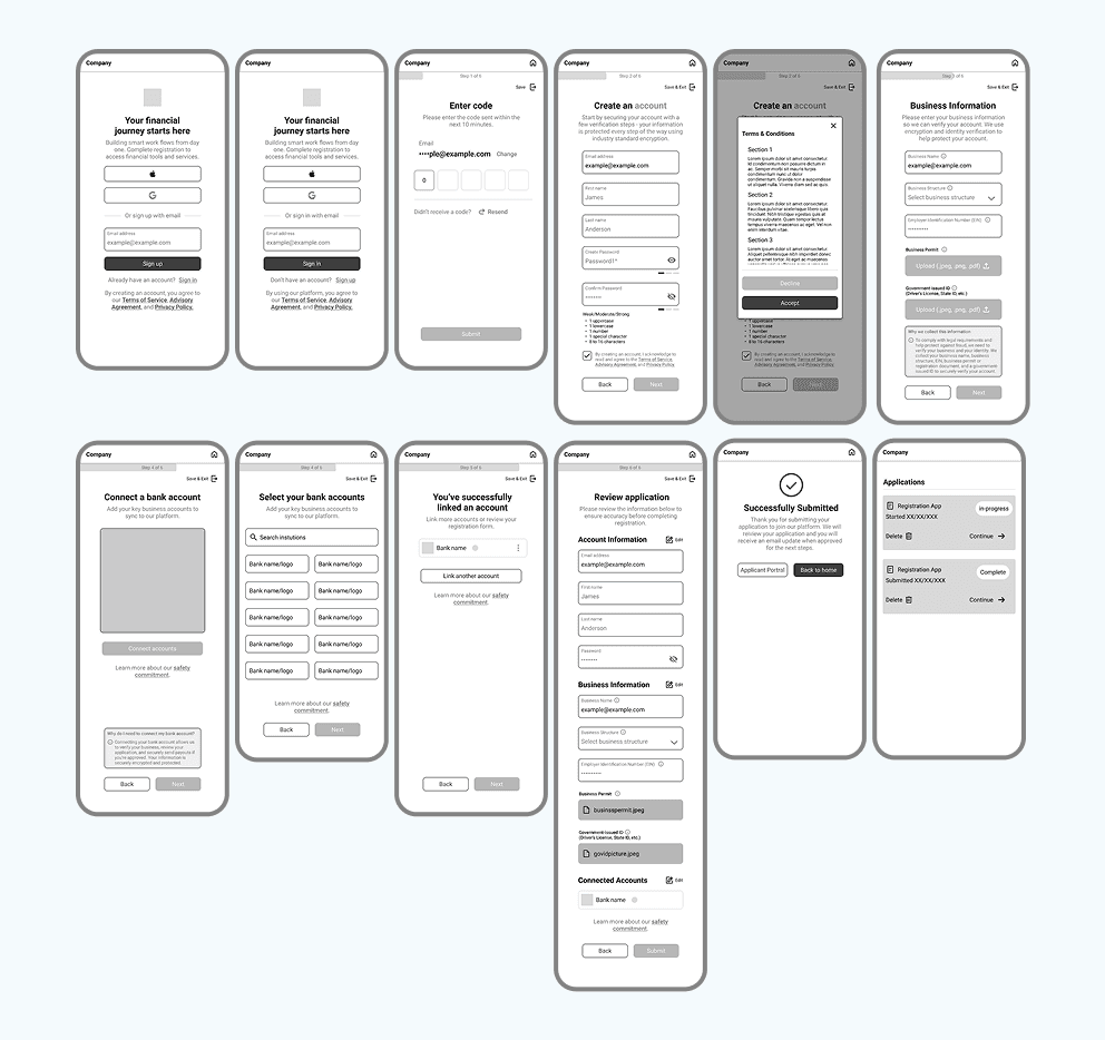
Before creating the hi-fi wireframes, I experimented with potential screens after sketching out a few ideas. I mainly focused on how to integrate progressive disclosures for the sections that needed them to explain the reasoning behind asking for sensitive documents. I also wanted to explore a few versions of how the applicant portal’s layout would look to ensure it was simple and intuitive enough for users to easily come back to when needed.
To ensure users could progress through the flow, I also made various input field states so it would help reduce confusion if there are any errors or if the user misses something before moving on. I wanted to work through the design while considering security, transparency, and an intuitive interface to make the experience as seamless as possible.
KEY DESIGN DECISIONS
Refining the User Experience.
For the final registration design flow, I focused on balancing out three priorities: signaling a secure trustworthy site, considering regulatory compliance requirements from stakeholders, and a low-friction user experience through UI guidance.

Throughout the flow and connected applicant portal, I designed it to be informative during the process if users get confused while also tailoring each sensitive document handling request to ensure users understand clearly how their information is used, protected, and why it’s necessary. Mainly, I aimed to reduce cognitive load from confusing financial terms and increase user confidence by setting clear expectations of each step of the flow.
The final design reflects a user-centered approach for the secure registration process. By combining progressive disclosure, authentication processes, transparency, and a conscientious user experience, I wanted to provide reassurance to users that they can trust the company’s process with sensitive information and manage their expectations.
Real-time UI Guidance & Feedback
To signal disclosures, errors, or inactive fields, I utilized color psychology to signal their uses. Most grays would signal an inactive or untoggled input fields. The high-contrast red color for both incorrect inputs and input fields would signal there is an error on the page and any error messages would also signal to the user they need to review their form. I also utilized blue to signal trust for sections that signaled a progressive disclosure and greens to signal correct inputs.
I included various input fields so users can clearly understand any potential errors and recover from them. Specifically, I made sure there were validation errors that clearly identify what needs to be corrected to reduce confusion.
So users don’t get confused or feel lost on during their application progress, I made a clear progress bar to signal an estimated completion time for users so they can decide whether to continue, or if they need to save a draft to gather their documents.
Progressive Disclosure

In order to establish user trust, I utilized short explanations explaining why certain info is requested. This would set expectations for users on how their sensitive information is handled and protected while building their trust through transparency.
A few disclosure statements are also provided for the more in-depth legal requirements that users can either view, decline, or accept to continue their application. While I did have disclosure statements in the final design, I’ve excluded the actual statements from this case study and replaced it with a generic Lorem ipsum as a placeholder text to protect the stakeholders’ intellectual property. However, the format of the actual statement is very similar to the design.
After reviewing the requirements, I noticed there was a UX risk when it came to connecting bank accounts for future payout purposes before the users’ application was approved. I suggested an alternative such as setting bank connections after the initial application review and when approved users first log in to their new dashboard. Since there were potential impacts on conversion and user trust, I explained a user may become frustrated if they are asked to connect their bank account only for their application to be rejected later.
The stakeholders ultimately decided to keep the bank connection step in because it supported their operational goals, including screening for fraudulent accounts and streamlining a faster future payout setup. Once that decision was made, I had to remove the "skip" button, but I focused on improving the experience by clarifying the rationale through the disclosure statements, adding the trust-building messaging around security and disclosures for the bank connections screen, and reducing friction in the connection flow wherever possible.
Save States

In case users need more time on their application or have to pause, I added in clear labels where users can save their application for later and also where they can either continue or exit the application.
Including save states reduces anxiety for users if they realize they don’t have all the necessary documentation. It also helps users in case they progressed further into the process, but need to pause.
Applicant Portal

Users can also access their application their the portal where they have options to view their application, continue, delete, or view their application status. Clearly labeling the application ensures the application process is as transparent as possible for users.
After submitting their form, users can view their application status within the portal itself. While there is an email notification system that was set up for the application, I also added in a final confirmation screen so it reduces anxiety and confusion.
PROTOTYPE
Usability Testing Results.
After putting together the required functions and making the hi-fi wireframes, I began creating the initial prototype.
While initially there seemed to be no major issues, there is a minor selection issue when using the dropdown options for the “Business Information” section of the step for the prototype. While this issue would not be present in the final version the developers were making, it did make selecting options when using the prototype confusing.
There is a technical issue in the prototype where the checkbox to confirm a user read the Terms & Conditions was checked. After taking a look into the interactions, some variants were not linked correctly. I’ll be looking more into it later for future prototypes and considering how to use more advanced variables to make a more accurate prototype for toggling checkbox-based interactions to reduce confusion for developers.

Takeaways.
Throughout the design process, I saw how trust is necessary to provide security and ease user anxiety, especially when handling sensitive documents, and by combining them together they can reinforce each other to create a positive experience. Trust is established through small, intentional interactions which I created through clear explanations, transparent communication about the data collection, and an intuitive system that makes the security measures feel purposeful instead of intrusive. Designing these aspects has reinforced how I can see how users are more willing to complete sensitive tasks when they have the information and understand why certain things are being requested.
While creating a registration flow is not as complex, what creates complexity is how to introduce the necessary security measures in a way users are comfortable. By refining the information architecture, simplifying interactions through UI guidance, and progressive disclosures, I created a secure registration flow that balances usability and security requirements. Overall, the importance of designing while considering empathy and security environments helped me consider user needs, business objectives, and technical constraints, which resulted in a secure and trustworthy experience.
Building Trust through Transparency
Due to the nature of the sensitive information being requested, building trust to ensure the user even makes it through the entire onboarding process requires signaling trust through proper explanations and informing the user of why these requests are necessary in the process.
Considering Security & Regulations
Allowing users to understand how their information is protected is a crucial element to help relieve any anxiety that may be preventing them from making a decision.
Simple UI Guidance
So users of any experience level can navigate through the interface, it’s important to consider which areas users may have trouble and anticipate where they may have questions during the onboarding process.
What if(s)?
In the future, some things to consider if the design is successful is to conduct more usability testing with users representing different levels of digital and financial literacy. By observing how users interact with the verification steps, multi-factor authentication, and flow would provide insight into areas where the experience could be improved upon. I would collaborate with developers, security, and compliance teams to ensure the final implementation is up to regulatory standards while having an intuitive user experience.
ADDITIONAL SCREENS

THANK YOU FOR READING MY CASE STUDY!