
Designing an SaaS subscription landing page to increase user conversion
Role
UX/UI Designer
Team
2 Full Stack Developers
1 Month
NDA: Visual designs have been altered and rebranded to protect the employer’s intellectual property.

CONTEXT
A Clear Pricing Tier Landing Page for a SaaS Platform
As the UX Designer for the project, I was tasked with creating a subscription pricing landing page while clarifying different features for developers.

PROBLEMS
Discovering the challenges.
After reviewing stakeholder requests and learning the business goals for the pricing page, I discovered a few problems that needed to be addressed:
Lack of structure - Due to a fast-paced timeline, there was no existing information architecture which made it difficult to navigate, locate, and organize the subscription pricing page which created confusion for the team.
Unclear tier features - Stakeholders had a mixed, ambiguous features list between free and premium features, confusing the developers on how to differentiate the tiers if there were going to be tier-specific CTA buttons or sorting premium users another way.
No clear sign up flow - The user flow was nonexistent which made it confusing for developers to understand how the subscription checkout flow would function which affected the pricing page’s CTA buttons and overall navigation.
UX copywriting - Stakeholders desired the subscription plans to have copy that would highlight features, but also showcase how each tier would deliver benefits
CHALLENGE
Create a high-converting SaaS subscription pricing landing page with an intuitive user flow to encourage conversion.
TIMELINE

Considering Best Practices & Conversion Strategy.
Evaluating how the issues affect the user experience through design principles:
Information Architecture
To create an organized, structured layout, I worked on creating different zones in the pricing page where each zone had a primary focus based on the information within each section. These were specifically arranged from top to bottom to reduce cognitive overload and decision paralysis as the user moves through the page.
Simplicity & Transparency as Non-negotiables
Building trust is key to converting future customers, so I wanted to focus on showing the value of each tier. I displayed values using clear feature comparisons, transparent pricing for each tier so customers don’t feel misled, pricing toggles for options, and customer personas to demonstrate how each tier is used.
Optimizing for Conversion
Since conversion is the highest priority for the subscription pricing page, I made sure to include various design elements to optimize conversion. These included a combination of clear, actionable CTAs, price anchoring to showcase value, signaling trust through social proof, and offering risk reversals for B2B customers who want a risk-free option.
UX RESEARCH
Discovering user needs.
After reviewing the potential issues that the project was facing and business objectives, I conducted research to gain a better understanding of what I needed to consider for both users and the business.

Key Insights.
Before exploring design concepts, I conducted a competitive analysis of subscription pricing pages across SaaS and e-commerce marketplace platforms to better understand the patterns users have come to expect during the decision-making process. My goal was to identify common patterns, evaluate where friction occurs, and uncover opportunities to improve the user experience.
Across the products I analyzed, there were several consistent patterns that emerged. The most successful pricing pages prioritized a clear visual hierarchy which allows users to quickly compare plans without feeling overwhelmed. Information was also organized progressively beginning with a clear value proposition followed by plan comparisons, feature highlights, and a frequently asked questions section for common concerns before checkout. I also noticed a few usability issues while reviewing the pages. These included cognitive overload for feature lists that were dense and difficult to scan, lack of price transparency for features or add-ons, and cognitive effort to determine pricing anomalies between plans that had little difference.
These findings informed my design strategy as I decided to focus on simplifying the plan comparisons, establish a clear visual hierarchy, and emphasized transparency. Through concise feature descriptions, clear price labeling, strategically placed CTAs, progressive disclosures, and information hierarchy, I aimed to reduce the decision fatigue and guide users through selecting the plan that matches their business needs.
Targeting Audience Segments through AI-assisted Tools.
As I was with a startup, there were both limited resources to gather a larger user group and time constraints. I was encouraged to explore AI tools to assist in information gathering and research.
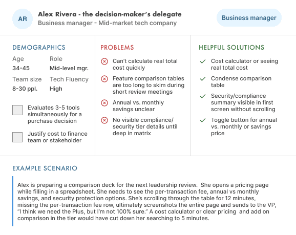


Unfortunately, due to time constraints, I was not able to gather a user group for interviews, however, after discussing with stakeholders what their ideal target audience was, I divided the ideal target customer into three segments: business managers, corporate business owners, and small business owners. I was encouraged by stakeholders to utilize AI agents as well to assist in quickly gathering research to help inform my design choices due to the limited time frame. I decided to use both Claude and Gemini after creating a detailed prompt with my research findngs to create a set of three user personas and compared both to cross check the similarities and differences then created a combined set of personas from both.
Using the three set of personas, I used them to help guide my decision process on design elements I should keep in mind based on the users’ needs. I primarily considered their company role, potential budget, and problems they needed to resolve as these areas were most likely to influence whether they select a plan or not since I needed to consider budget restraints and potential company problems. These areas would help inform me how I can improve the visual hierarchy so all relevant information within the page is accurately conveyed so it’s clear enough that users don’t bounce off the page. From these personas’ concerns and goals, I focused on how to simplify plan comparisons in combination with my design strategy.
Affinity Mapping.

Once I gathered all my insights from my research and personas, I created an affinity map where I rearranged common themes centered around usability and information hierarchy that influence the user’s decision making process. My primary goal was to determine the various factors that influenced user purchase decisions by grouping together possible solutions with design choices when selecting a subscription plan.
The group clusters included: trust & credibility, choice overload, feature comparison, value perception, and decision confidence. These grouping insights became the foundation for designing the subscription pricing page as it helped determine how I would structure the information hierarchy around the feature comparison chart and how I would strategically address these problems from the viewing the tiers down to the FAQ section.
Simplifying plan structures
Improve feature explanations
Increasing price transparency
Adding reassurance elements
IDEATION
Defining the concept.
When I began sketching, I focused mainly on the visual hierarchy and the layout of the information architecture as they were the most relevant to whether a user decides to purchase a subscription plan.
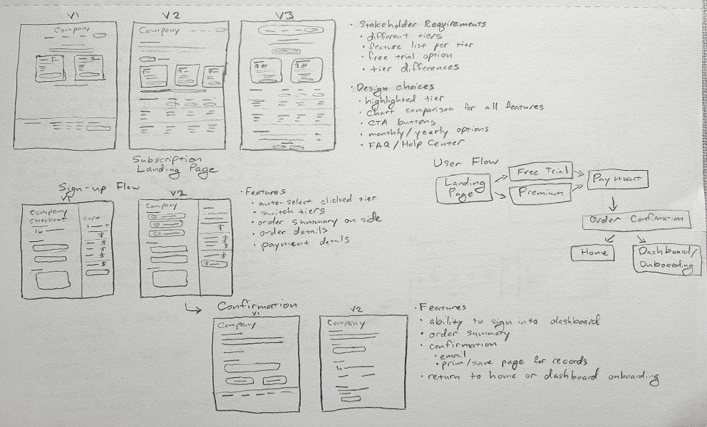
I SKETCHED 3 ITERATIONS CONSIDERING THE CORE FEATURES NEEDED.

For the hero section, I included a list of design features I wanted to keep in mind since it would be the first section users would view. In the feature comparison chart, I compiled all the features that would improve the readability, reduce cognitive load, and build trust so it would help improve users’ decision making process through clearly labeled information they may need.
Including an FAQ section was also necessary in order to help build trust and as a final step to the users’ decision-making process. With the FAQ section, it would offer transparency for common questions users may have before they decide to purchase a subscription and improve the likelihood of them converting to a subscription.
KEY DESIGN DECISIONS
Settling the final design.
Once I settled on the final changes to the lo-fi design and made some adjustments, I created the final hi-fi design.

By combining the design principles, I focused my design strategy around information architecture, clear labeling for pricing and feature transparency, and optimizing various elements for conversion.
Using these principles, I utilized various elements to build a pricing page that was intuitive enough with all relevant information to signal trust so users can ultimately convert to a subscription after determining their needs are met from the information presented.
Subscription Pricing Tiers
By including strong, high contrast CTAs, I wanted to highlight it’s visibility. I also used action-oriented and reward-based copy that focused on the benefits so it is easily communicated what users will get when users decide to act.
In order to reduce analysis paralysis, I optimized the tiers by limiting them to two options. There were discussions with stakeholders about adding a third tier, but it was shelved for the future once the stakeholders finalize more details since it was uncertain. Any more than three would increase the page’s length for the comparison chart which would potentially increase cognitive load.
I utilized price anchoring within the tier cards to display the best value for users that could push users to select the second tier, which had a better value with advanced features. I also utilized a markdown label to showcase the value differences between monthly and yearly plans.
So it was easier for users to compare plans, I used a price toggle button for the monthly vs yearly pricing plans. This would improve pricing transparency for users who want to explore and compare their options without being misled.
There was also a testimonial section containing placeholder company names under the tier pricing cards that would have served as social proof to build trust with new users. However, stakeholders asked me to remove it for launch since they did not have real testimonials available to display.
Feature List / Comparison Chart
Some common elements I noticed were the use of example user personas to help guide users. By including these personas, it could help users quickly identify which tier is geared for their needs without having to read through the whole comparison chart.
To clarify features within the comparison chart, I made clear labels for specific features and colored icons to reduce confusion about what features are available per tier.
Instead of focusing on the pricing value, I utilized more value-based UX copy to convey the benefits that would be most useful for users such as more comprehensive analytics and exclusive premium features.
FAQ Section
To address common user concerns, I included five of the most common questions that may be related to the subscription tiers. This would help build trust and transparency so users will know exactly what to expect when they choose to purchase.
By answering difficult questions right away, it would reduce anxiety and build trust for users. This also reduces an extra step of contacting support and waiting for a response if the user has a common question.
Mobile Optimization
To make the design more mobile-responsive, I utilized sticky a CTA header in the comparison chart to improve the user experience and conversion so the user doesn’t need to continuously scroll back up the page.
The header navigation menu was also designed to be sticky so it would be easier to view the navigation bar on mobile.
In order to optimize the comparison table for mobile, I changed utilized colored icons and clear labeling for each feature for better readability.
PROTOTYPE
Usability Testing Results.
After creating the final prototype, I presented the final design to stakeholders for their feedback. Most of the final design remained the same, however, the stakeholders asked me to remove the testimonial section under the subscription tier cards.
While they agreed that it would build social proof and user trust, since the full product was not launched at the time, there were no real testimonials or reviews available to display. So, while it would be kept, it would not be included at launch, but added after they’ve gathered testimonials.
Takeaways.
Throughout the design process, the most challenging aspect was determining how to visually break down the information hierarchy in a digestable way. Since the goal was to make it as scannable, informative, and trustworthy as possible, it was crucial that I maintained a balance of information and visual design throughout the whole page.
Designing the pricing page reinforced that effective UX principles goes beyond creating a visually polished interface - it requires a deep understanding of how users make decisions based on their needs. Throughout the design process, I found that small design choices such as simplifying the feature comparison chart, improving the pricing transparency, and establishing a clear visual hierarchy can reduce user anxiety and support confident decision-making.
My biggest takeaway is that it is important to highly consider research rather than base design decisions based on assumptions. After conducting my market research and affinity mapping, I found it helped me transform insights into broader themes that I identified through my research and helped me prioritize underlying user needs. During this process, it helped me create a design solution that balanced business goals with a user-centric experience.
Overall, this project strengthened my ability to translate qualitative research into creating intentional design decisions.
Understanding the User’s Decision Making
Fully understanding which types of personas are landing on the page is crucial to deciding how the page will be designed so it can provide solutions to the problems users are facing.
Research-based Decisions
Compiling research-backed information greatly helped inform my design making process which made it easier as I was able to fully consider each type of users’ needs and helped me anticipate what may or may not be needed.
Creating Digestible Information
Since the information needs to be both informative and simple to understand at a glance, balancing the information with the design was crucial to creating an informative scroll through the page through a combination of iconography, information hierarchy, and value-based information.
What if(s)?
In the future, the usability testing process can be further expanded upon. These would include validating design decisions through a larger, diverse user group through A/B testing. Helpful metrics for this include measuring the conversion rates with GA4 to track the customer journey, observing session recordings through heat mapping tools, and key metrics such as bounce rate and time spent on page by users.
FULL SCREEN DESIGNS

THANK YOU FOR READING MY CASE STUDY!