
Role
UX/UI Designer
2 Months
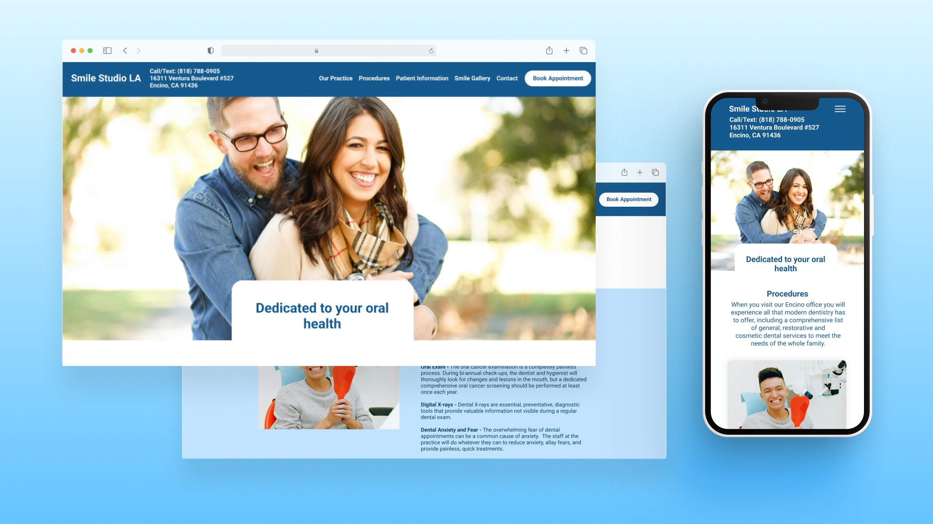
CONTEXT
Redesigning a Modern Dental Office Website
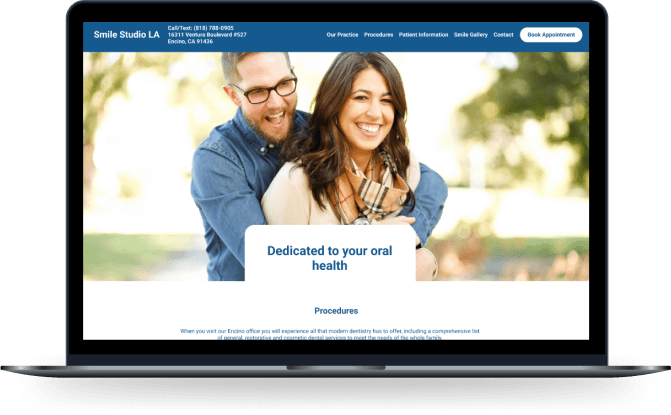
Smile Studio LA is a dental office located in Encino, California that wants to move towards a modernized website design.
BEFORE VS. AFTER
PROBLEMS
What issues is the office currently experiencing?
As the UX Designer, my primary goal was to redesign Smile Studio LA’s interface to have the impression of a modern dental website and translating it into a usable mobile version. I was also tasked with finding any defects within the old website then revamp and improve these issues in the new website design.
What are the User Needs?
Dated → Modern - The current website design was originally made in the early 2000s, so the design is outdated and also has various usability issues with broken links and repetition.
Cluttered → Organized - As a dental office, there is a trend for providing articles to inform patients for their dental care which includes vast amounts of information. However, due to the various categories, there are some articles that fall under the same category and face a lot of repetition as well as it being difficult to navigate around the site.
Identity Confusion → Visual Clarity - When first looking at the website, it does not have the impression of a dental office due to the colors used. After talking with the doctor, a lot of issues have stemmed from this where people mistakenly think it’s a photography studio since it a more aesthetic look. The office name also makes it confusing for first-time visitors.
CHALLENGE
Redesign the website so it feels like a modern dental office website while also improving upon the current issues the website is facing.
UX RESEARCH
Understanding the Problems.
To gain more insight into what people are expecting to see on dental sites and their thoughts, I interviewed a group of young adults and examined patient testimonials about the client’s office.
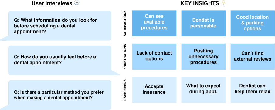
Key Insights.
In general, it’s normal for people to be nervous during dental or health visits. However, based on these interviews, people tend to become more anxious when they lack enough information to make what they feel is a good decision for their oral health. If they can learn whether the dentist is trustworthy, experienced, and empathetic with their anxieties, they feel more relaxed and confident in booking an appointment.
While conducting my market research, I discovered numerous commonalities between dental websites. Many use blue since it is commonly associated with medical industries. There were also various methods sites use to convert patients through appointment booking buttons or having clickable contact information located in various part of the website (header, footer, contact boxes). However, I noticed there were also issues with how procedures tend to be listed depending on how they’re presented on the site.
Simplifying for a better user experience.
Before working on sketches for the website and its features, I wanted to gain a better understanding of how patients navigate the site.

AN OVERALL SITE MAP EXCLUDING ALL PROCEDURE ARTICLES UNDER THE VARIOUS SERVICES CATEGORIES
Adjusting the site map.
Originally, the website had an extensive amount of pages I went through to check for inconsistencies and errors. After removing broken links, repetitive pages, and starting to recategorize the information, I built a new site map (excluding all the individual procedures from the main ones) that compiled the most relevant information patients would find useful.

USER FLOW BASED ON THE USER JOURNEY WHEN A FIRST-TIME PATIENT VISITS THE SITE
Mapping out the user journey.
To ensure I had the design mapped out correctly, I created a user flow map to outline the user journey for a first-time visitor. This way, I could create an accurate flow of how the pages are navigated between each other as well as identify what aspects I might be missing. Since there was already a vast amount of information I had to sort through and fix broken page links, this also helped me determine how to reconnect the broken page links to each other.
IDEATION
Conceptualizing the New Designs.
Before creating lo-fi mock ups, I created 46 iteration sketches to get better ideas of how to simple the layout since there was a lot of information to sift through when I did the UI audit.
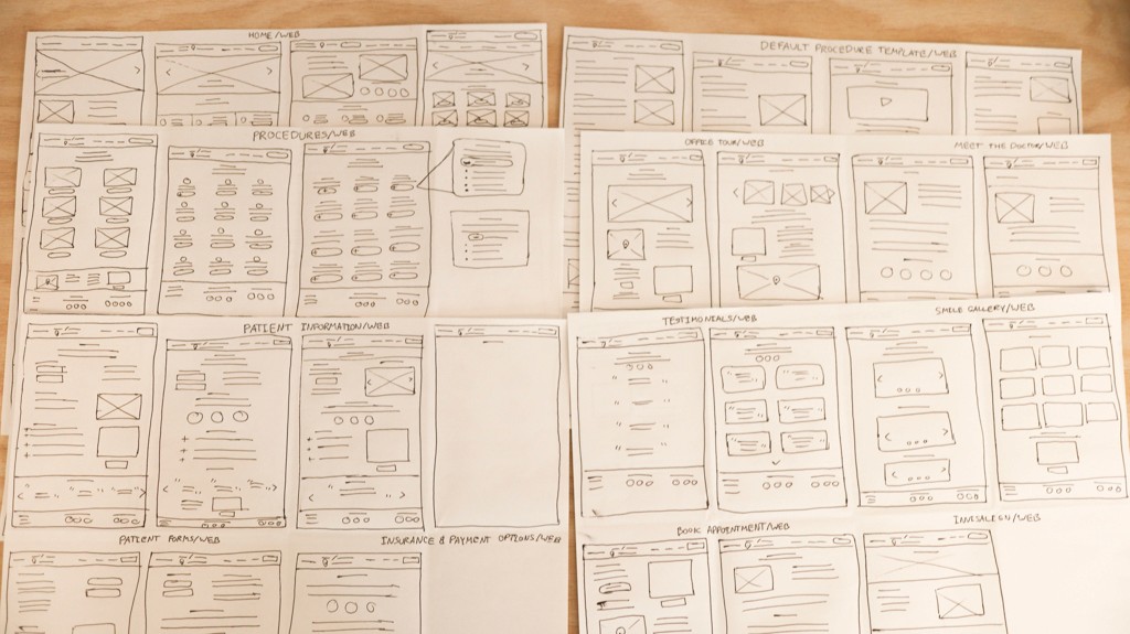
46 SKETCH ITERATIONS BEFORE REFINING THE FINAL SCREENS
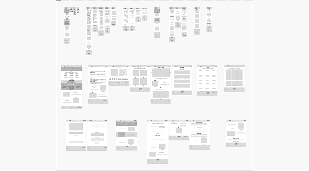
Lo-Fi Wireframes.
I experimented with various screens after selecting the best sketches that had the main functions. Since the client primarily wanted to focus on a mobile experience, I first designed the screens around mobile then upscaled it and rearranged the layout for desktop. Although some of the lo-fi wireframes, ended up different from the final screens, the new iterations ended up have a better user experience.
KEY DESIGN DECISIONS
Addressing the Core Functionalities.
For the redesign, I primarily focused on three main areas: the home page, procedures/services list, patient information, and accessibility check.
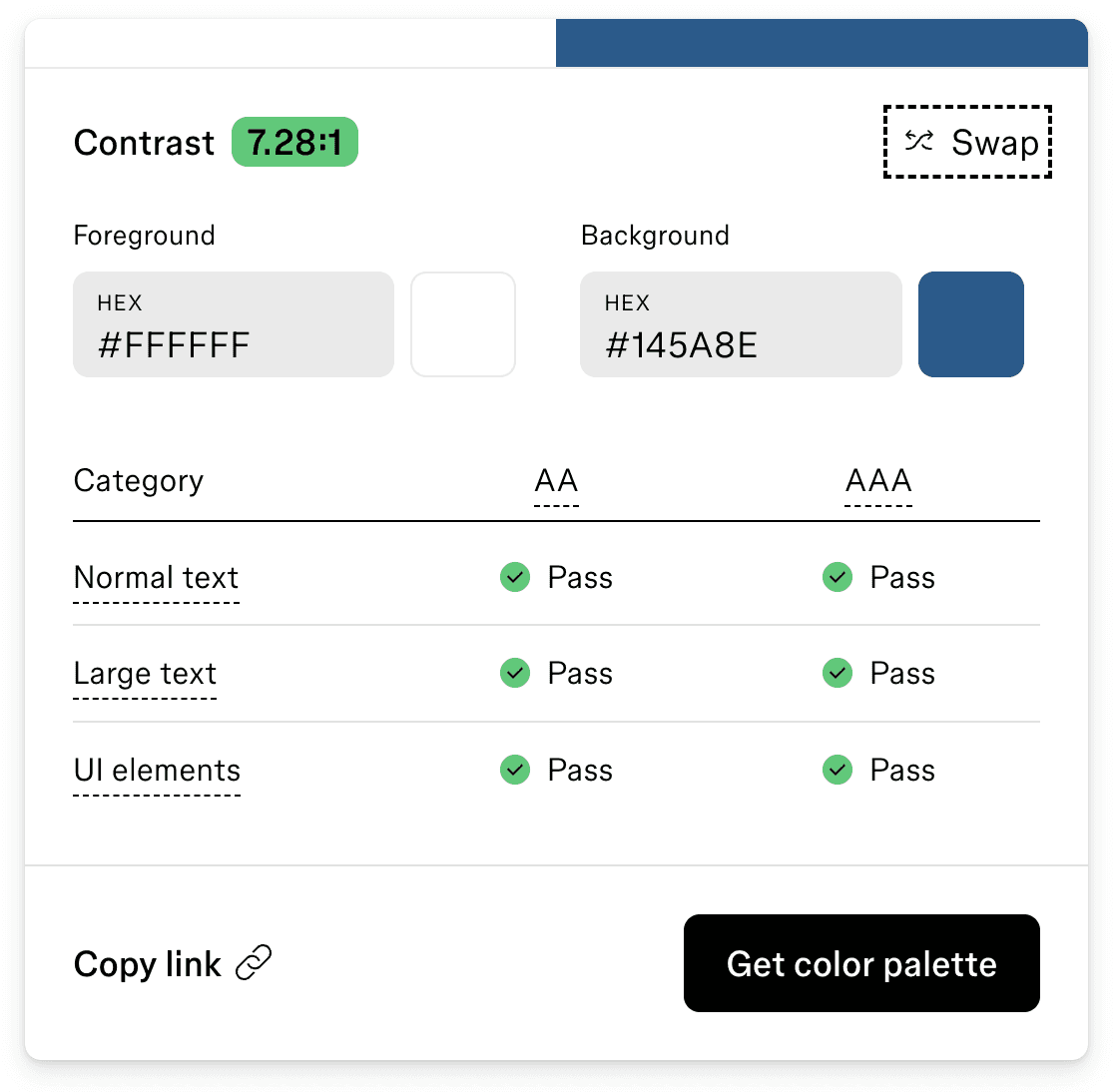
Accessibility Check.
When selecting the new color, I confirmed whether it met readability standards as the client mentioned he does have some older patients. I also made sure the minimum text size was at least 16 px so they could be read on mobile screens as the smallest text size was originally 11 px.

Home page.
After creating the hi-fi mock ups, I experimented with new iterations to better assist with the visual identity of the website as a dental office using specific jargon to make it as clear as possible.
I also tried out a few versions of info cards for the dental services available to make information more visually digestible for patients when they first view the website.
Solution: In the end, I decided to combine elements of the 3rd version with the 1st version after feedback so the hero text could be more visible. There were additional changes in the final version since there were issues with Squarespace not being able to implement some design elements, but the final version is relatively the same.

Procedures.
I wanted to explore how it could look if the procedures were in a bullet point layout. Due to the number of procedures listed, I thought the design could be visibly easier for patients to locate specific information.
There was a lot of empty white space on the page which was common for dental sites, however, there were issues with how patients could determine which link to click since they may not know what type information to look for.
Solution: After deliberation, Version 1 was rejected in view of Version 2’s design layout.
To make the jargon easier to understand for patients, I decided to include brief descriptions of the most common procedures patients search for dental appointments. Each of the procedures also link to a page that contains other services under the associated category so patients have more clarity of what type of procedure they will be undergoing.
I also added more visual elements like relevant pictures and alternating colors so it’s more interactive to scroll through the different procedures offered at the office.
Solution: I decided to go with Version 2 after user feedback that it felt more reassuring for patients that they were able to see some brief descriptions of the different procedures and could click into the pages to learn more.

Patient Information.
To keep the information page simple per the client’s request, I utilized a download button for patient forms and had it separated from the info so it’s easy to find on screen when landing on the page.
Below the patient form information, there is also more information related to insurance, FAQs, and a contact form so patients can directly book appointments from the page.
Solution: Simplifying the patient information page was the goal in order to direct patients visually to what they need for appointments. Whether it’s the patient form or if they need to check if they have the right insurance, the page was designed to create a streamlined layout.
PROTOTYPE
Usability Testing Results.
After creating the last prototype, I discovered some minor issues where I did some workarounds for the Squarespace website.


There was a hero slideshow implemented in the prototypes, however I had to discard it in favor of only one hero image when converting the design to Squarespace as Squarespace’s functions were not allowing me to create a hero slideshow. I also made minor changes to the header since Squarespace did not have a feature I could find that would allow me to show the contact information.
While the website layout is more modern, the client did not have any updated images (office tour, profile picture, smile gallery) and was unable to find the original files. Some images may appear low-resolution for larger screens due to this as I saved them directly from the old site as I had no method of obtaining the original resolution images.
Takeaways.
I had some minor issues using auto-layout since it was the first time I used it to this extent in order to decrease the amount of time spent wireframing. However, once I set up the components correctly, it saved time when creating the high-fidelity mockups.
This was also the first time I utilized Squarespace so I wasn’t fully aware there were certain functions that could not be done unless coding was involved. In the future, I’ll be aware that the design may not be formatted exactly like the prototype for this reason.
THANK YOU FOR READING MY CASE STUDY!